Miracle

Project Snapshot
Cybersecurity platform used by security teams to investigate suspicious files and hashes, analyze potential malware, and review technical findings through generated reports and agent-supported insights.
Due to confidentiality, the project and client names are anonymized throughout this case study.
My role was to redesign the platform’s core experience, turning dense technical workflows into a clearer, more scalable investigation workspace.
During the process, the product logic evolved to support investigation across multiple related files, which required rethinking the platform structure, navigation, and information architecture.
The Challenge Behind the Interface
Redesigning a complex technical platform with dense information and evolving product logic.
As I began redesigning the existing platform, the experience was mainly centered around analyzing a single submitted file or hash. During the project, the product logic changed: the platform needed to support a broader investigation model.
This shift added a new layer of complexity. The interface now had to help users understand the full investigation chain.
My Role in Shaping the Solution
Project type: Freelance client project
Role: Product Designer
My work went beyond visual redesign and focused on reshaping how the platform’s complex workflows are structured, understood, and used.
I worked on the platform’s UX, architecture, main flows, screen layouts, UI design, reusable components, edge cases, and interaction states.
Existing Platform
The original platform experience was mainly built around submitting a file or hash, running an analysis, reviewing the generated results, and chat with the agent for deeper investigation.
Home - Submitting a sample

Home - Past Analysis


Analysis Findings

Chat With Agent

At this stage, my focus was to improve clarity, hierarchy, and usability across the existing flows, while keeping the technical depth required by security teams.
Understanding the Core Flows
Before moving into structure and screen exploration, I mapped the main flows to understand how users move through the platform and where the interface needed to support decision-making.
User goal: submit a suspicious file or hash, review the generated results, and continue the investigation with agent support when needed.

User goal: find a previously submitted file or hash and continue reviewing its analysis.

Finding the Right Structure
At the beginning of the redesign, I explored different layout directions for the existing platform experience.
Low-fidelity wireframes
Home - Submitting a sample

Sidebar layout focused on a centered submission experience
Top bar layout with additional platform context and active analysis data
Previous analysis

Analyse page

Metadata bar, high-level overview, and a report section with a sidebar navigation menu
Analyse Page & Chat with agent

Chat with agent button - placed inside the report content
Horizontal split: chat placed beside the report

Chat with agent button - placed in the report sidebar menu
Vertical split: chat placed below the report
Mid-fidelity wireframes
Home - Submitting a sample

Analyse findings

Chat with agent - Horizontal

Chat with agent - Vertical

Outcome
These explorations helped define the first redesign direction and created a stronger base for the platform structure before the product later shifted toward a broader file-chain investigation model.
Bringing Structure to a Dense Interface
The goal was to reduce visual overload, create clearer hierarchy, and make the analysis flow easier to scan and use.
Submitting a Sample
A cleaner submission area helps users start analyses faster.
Configuration were simplified into compact controls, reducing unnecessary scanning.
Before
After

Analyse Findings
Added an in-report menu so users can jump between long report sections
Moved analysis details to a side panel, freeing up vertical space for easier report scanning


Chat With Agent
Kept the horizontal layout to maximize report space and improve scanning
Designed the layout to scale with multiple chats, long reports, and deeper investigation paths
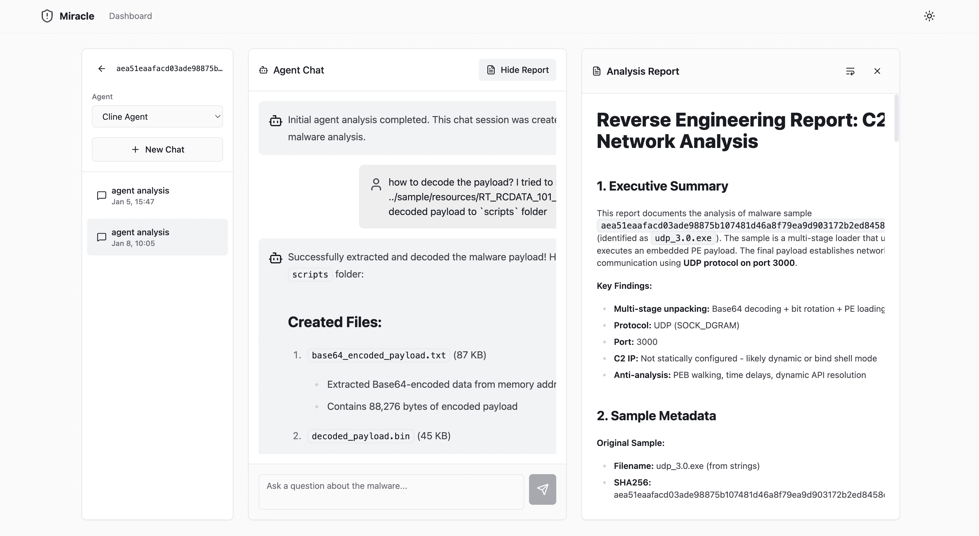


Earlier chat layout exploration:

Horizontal chat tabs + dropdown report menu

Chat dropdown menu + report menu inside the report panel

Persistent chat history panel + fixed report menu
View Previous Analysis
Split analyses into Past and Active for clearer task context
Added search, sorting, and pagination for faster table navigation
Added key tracking data like duration, price, and user
Included key, useful filters into a clearer panel, making filtering easier to manage and more intuitive
Before
After
Product Shift
Midway through the redesign process, a technology update changed the product logic.
The platform needed to support a broader investigation model: a single submitted file could reveal related or extracted files, creating a chain of files that each required analysis and review.
The product shift changed the design challenge. The interface needed to support an ongoing investigation workspace where users could move between files, understand their relationships, track analysis progress, and review file-level findings without losing context.
From: One file → One report
To: Submitted file → Related files discovered → File tree expands → User reviews each file → File-level report
Managing the Product Shift
To respond quickly to the new direction, I used an AI-assisted workflow that helped me move from rough product input to screen exploration, client validation, and Figma refinement.
Step 1 — Making sense of the update
Clarified the change - I approached the client to understand what changed, why it changed, the main priorities, and the project deadline.
Reviewed product impact - I worked with the developer to understand how the update affected existing flows, data, screens, and technical limitations.
Defined design implications - I mapped what needed to change across the user journey, information architecture, navigation, and UI structure.
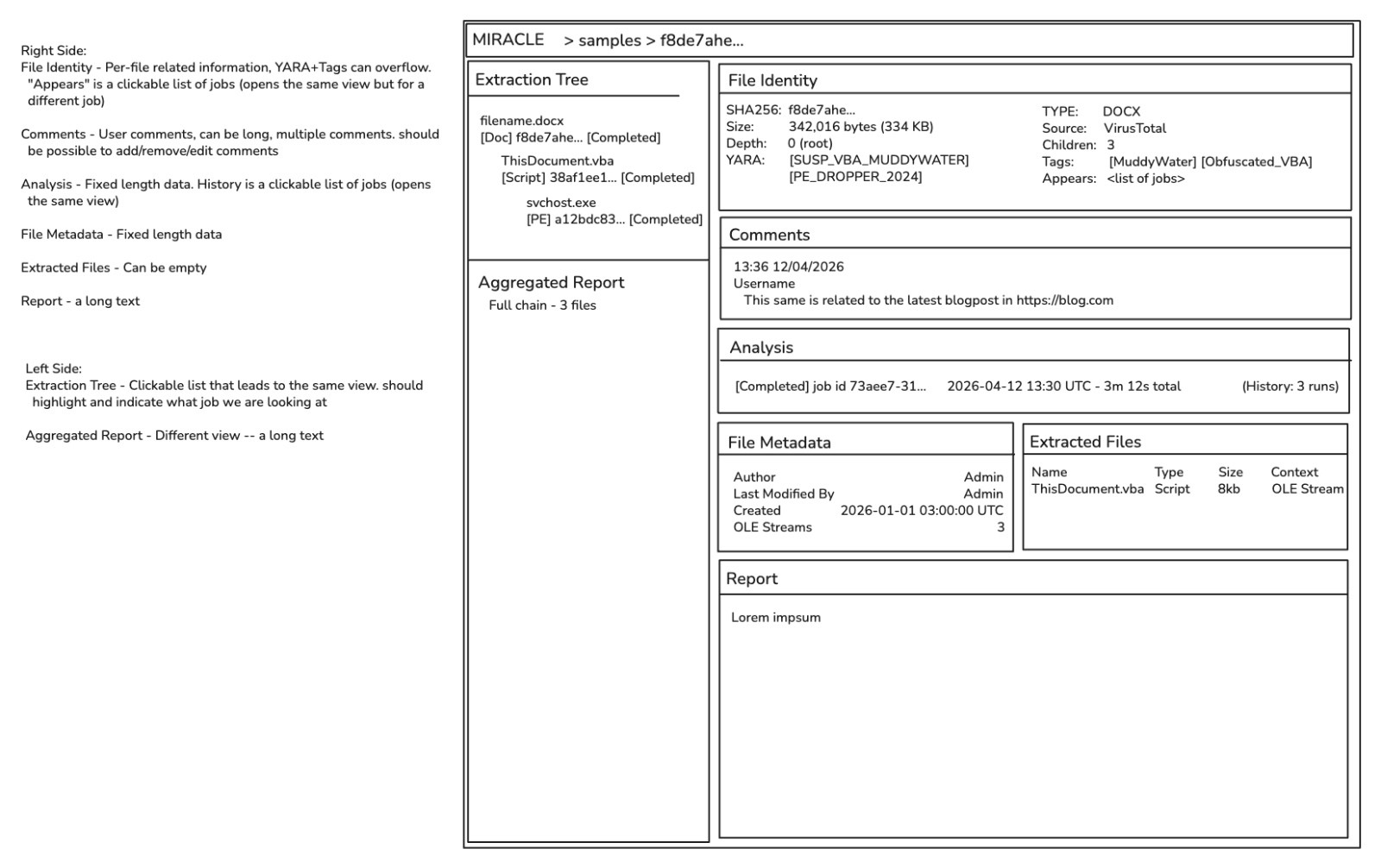
**A sketch the client provided.
Step 2 — AI prompt setup
The PM and developer provided an updated product brief and API surface based on my request.
Then, I created a detailed Claude prompt to explore updated screen layouts and attached the platform screens, design library, product brief, and API surface for context.



Step 5 — Client validation
I reviewed the directions with the client to decide what was relevant and in scope.
Step 6 — Figma MCP drafting
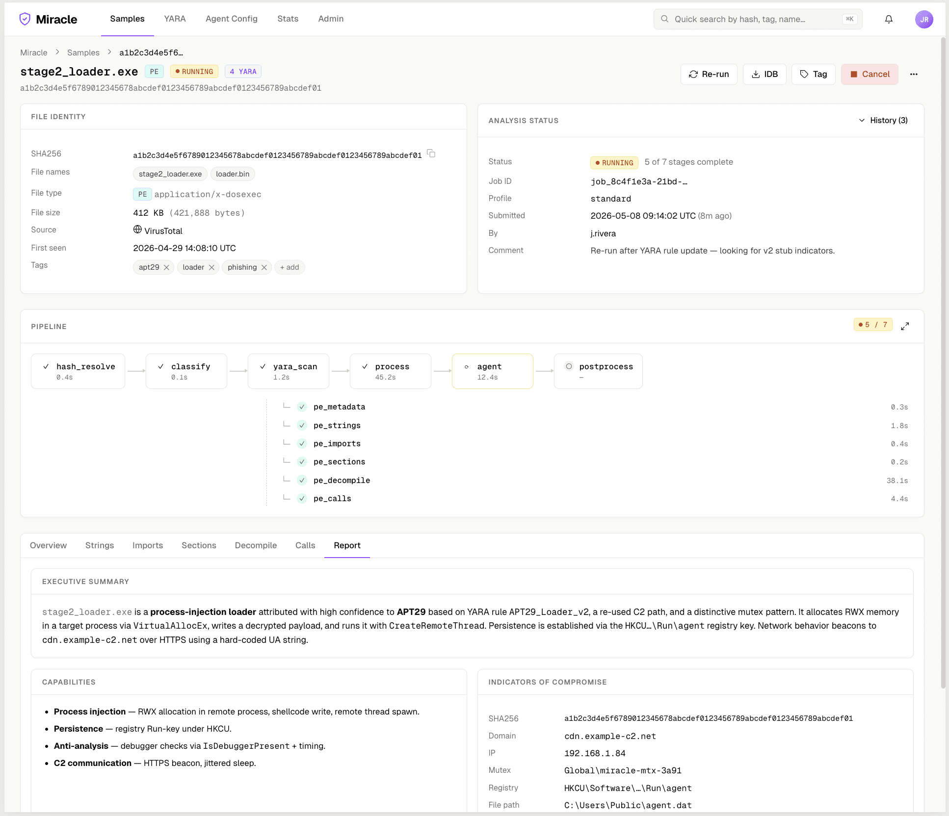
After approval, I connected Claude Code to Figma using MCP to speed up the first high-fidelity drafts of the new screens.
To guide the output, I provided low fidelity wireframes and references from the earlier screen explorations, so Claude could follow the right structure and direction.
At first, Claude screens didn't aligned with the design quality I wanted:


After refinement, the screens became closer to the product direction and design quality I aimed for:


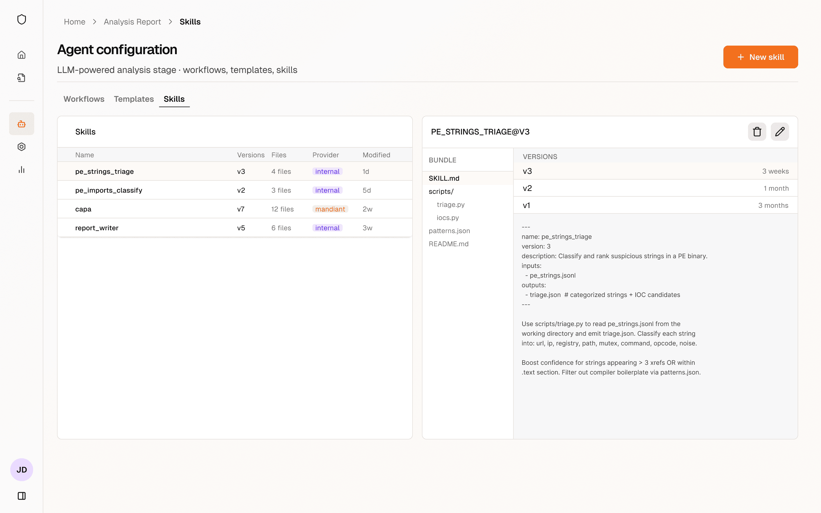


The New Investigation Experience
Updated structure:
Submit file/hash → Related files discovered → File tree expands → User selects a file → Reviews file-level data and reports → Performs additional investigation as needed
Persistent file tree
Provides a stable view of file relationships throughout the investigation, helping users understand which file they are viewing and how it connects to the full chain.
Additional content: strings, imports, sections, decompile, calls, report and relationships.

File-level tabs
Separates complex technical information into focused sections, reducing cognitive load and helping users review one aspect at a time, and locate information more quickly.
Content-specific presentation
Different information types were displayed in the format that best supported understanding - tables for structured data, status badges for progress and results, text sections for explanations, and diagrams for relationships or process logic.
Additional dedicated product areas
Agent Configuration and YARA Rules were separated into their own areas to support investigation, control, monitoring, and system management.


Scalable structure
While redesigning, I focused on creating a reusable structure that could support different file states, changing analysis progress, missing data, long reports, and future product growth.
Before & After
Home - Submitting a sample
File analysis

Chat with agent
All analysis
